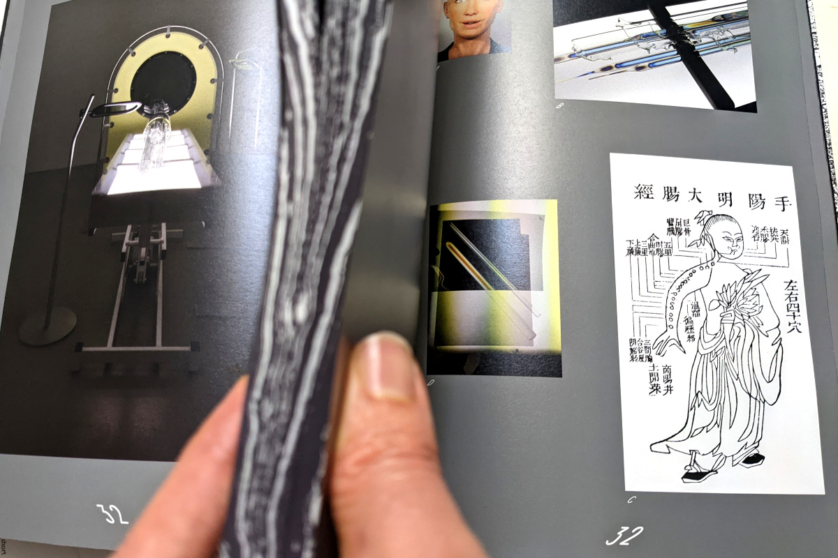
This book accompanies Tauba Auerbach's exhibit now showing at SFMoMA. It's an interesting piece of art in its own right. That's a good thing, I guess? I find myself comparing it to an earlier book documenting Auerbach's early work, How to Spell the Alphabet. The earlier book does a pretty darned good job documenting those early works. It's relatively easy: those early works are mostly flat images (aside from some mapping typewriters that can be satisfyingly understood by means of simple pictures and something to demonstrate their map transformations; and a zine-like booklet that can be pretty well appreciated as a series of flat images). But Auerbach's later works are more complex; e.g. "Non-Invasive Procedure," a set of concentric glass tubes that glisten with soap-film-like color when viewed through a polarizing filter (oh yeah on a medical-procedure table thingy). You can't imagine what it's like to approach this work, to observe it with and without filters. You can't imagine it based on my words, based on now-hazy memory. I can't imagine it based on the picture in S v Z, sadly, even though I have some now-hazy memories to help me. It wouldn't be reasonable to expect a mere book of images to capture these works. Yet—the book is nevertheless interesting.

(Those of you looking closely at this picture are wondering some things. Why does this book have two pages 32? Why do those page numbers look fisheye when other stuff doesn't? Why is Larry holding a piece of black marble(?) in the foreground? Look, I'll get around to explaining all of this, but you need to be patient.)
The book S v Z is not exactly an exhibit catalog. Some items exhibited aren't in the book; some items pictured in the book aren't in the exhibit. E.g. the book shows some octothorpe lapel pins; I don't know that there were any of those at the exhibit (although I guess I could have Heisenberg-ly known if'd worn my pin when I visited). At the exhibit, I spotted some Yin Yang pins stuck in the wall; but they're not pictured in the book. The exhibit includes some items that clutter Auerbach's studio (presumably providing inspiration), not necessarily created by them. Among these exhibited items was a simple almost-Klein Bottle from Cliff Stoll's Acme Klein Bottle company. In the book, there's no simple almost-Klein bottle. However, there is a picture of a more complex triple-layer almost-Klein bottle (the physical bottle is by Alan Bennett and lives at The Science Museum in London), really quite extraordinary. The interpretive text for this picture doesn't explain its relation to Auerbach. Do they have this picture in their studio? Do they just think it's neat? In my imagination, they have picture in their studio; when the museum asked to borrow it for the exhibit, Auerbach said, "Aw, go ahead and exhibit a simple one-layer bottle from Acme; I want to keep my picture around; it's not like most people visiting the exhibit have listened to Cliff Stoll ranting about Klein bottles for minutes on end; they'll probably think this simple one-layer dealie is mind-blowingly exotic." Yeah, so anyhow: contents of the book ≠ contents of the exhibit.
OK, so the book (reasonably) can't fully document the works; it's not a complete catalog. Why is it worthwhile? It has other things going on.

The title S v Z refers to (brace yourself) the chirality of helixes; that is, for corkscrew shapes, whether the corkscrew twists clockwise or counterclockwise. Depending on that direction, when you look at the corkscrew from the side, its edge might look like an S or Z. Chirality in general is the concept of "handed-ness". Your hands have chirality; scissors have it, too; this book has it. Well, all have handed-ness. Left-hand pages and right-hand pages usually have roughly opposite layouts so that each two-page spread will be kinda symmetric. S v Z goes above and beyond, chirality-wise. Auerbach's into chirality; and channeled their interest into this book's design. Most books start at the front and progress to the back. This book starts from both ends, working in towards the middle; one side is S; the other Z. Earlier, you perhaps wondered why the book had two pages 32. These are pages 32S and 32Z. Both pages 32 address the same artwork. Thus, you can see something like a two-page spread about an artwork by gripping together pages 33S–33Z upright and wobbling your head from side to side to see around them. (I'm not sure the head-wobbling was their intent, but it's how it turned out.)
(With the opposite-sides-of-the-book-pages being related, I kinda expected those pages to be from the same piece of paper, like a staple-bound magazine. But the book's not bound like that. So that's two ways that the book's not bound in the way I might have guess if…but I'm getting ahead of myself again; it's all interconnected. We'll get to it, we'll get to it.)
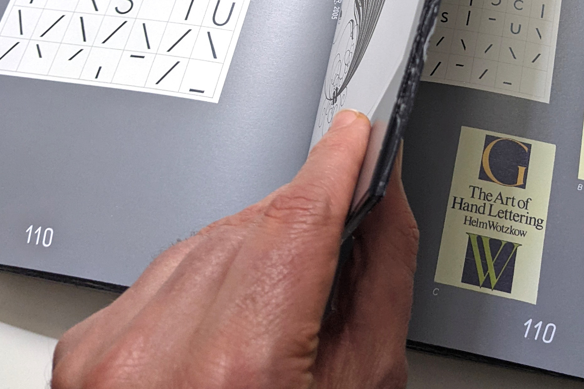
The book's font also uses handed-ness. As you flip from 127Z forward to 1Z, the font goes from upright to angled to exaggeratedly-illegibly angled. It's darned annoying; you really have to squint to read the last several pages; and that's where the interpretive text is. (There are essays by art scholars in the 120s; those are quite legible, thank goodness. But I, a philistine, only halfway understand the scholarly essays nonetheless; but I'd appreciate knowing the materials and titles and… anyhow.) If you flip backwards through the book from 127S to 1S, the font again goes from upright to angled to exaggeratedly-illegibly angled; but now it leans left. Earlier, you perhaps wondered why the page numbers looked "fisheye"; that's because their font was angled in opposite directions.
I'm not sure why this book isn't a pair of spiral-bound volumes with one volume's spiral-binding going the "wrong way." This seems to fit the S-helix/V-helix theme better. The artist already makes such "handed" spiral-bound books. Maybe SFMoMA folks worried their fancy-pants usual visitors wouldn't buy a book that didn't show off its artsiness on a spine. (The GEOS documentation books were wire-bound; because they couldn't display titles on their non-existent spines, for a while I could recognize different volumes by their thicknesses.) It's fine; bound the way it is, there will probably be less wear on the pages than if they were spiral bound.

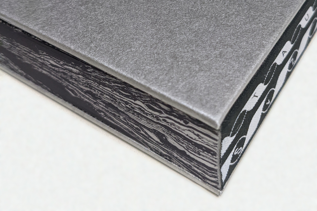
The edges of the paper are decorated with a marble pattern; specifically the part of the pattern of Flow Separation, in which they decorated a decommissioned New York fireboat. If you wondered why it looked like I was holding a chunk of marble; it was marbled pages.
And there's more to the book. There's art, of course… oh good grief, this Book Report is already so long, maybe I'll let someone else write about the actual book contents instead of structure. From the scholarly articles, you find out that Auerbach grew up reading Martin Gardner and Flatland, which perhaps explains why their art makes as much sense as it does.(But whence the interest in codes and signals? Back in my day, we had the KnowHow Book of Spycraft, but the artist may have been born too late for this.) And some of the art pieces documented in this book are themselves books (though most aren't).
There's a lot going on here; the artist's decisions, as ever, resist easy interpretation. It's a fine book for a puzzlehunter to ponder. There's no hidden message; this isn't one of those puzzles. Maybe it's more like one of those metal-rings puzzles; an intricate interconnected system. As you think about how it was put together, it's a good way to stretch your brain.
