This news article's data visualization is like a series of tubes. (It also make some neat inferences about changing work patterns and why San Francisco's city budget has stupidly preventable annual crises.)
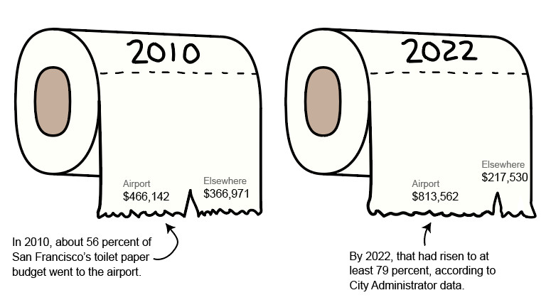
This news article's data visualization is like a series of tubes. (It also make some neat inferences about changing work patterns and why San Francisco's city budget has stupidly preventable annual crises.)
Tags: link
