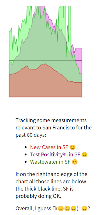
I continue to check my little dashboard of San Francisco COVID numbers each morning to estimate risk of inessential-but-nice indoor activities, e.g., whether I want to go grocery shopping in person so I can pick out the best poblano pepper available instead of leaving such decisions to fate. For the past couple of months, I eschewed such activities, but lately the San Francisco COVID numbers have come down, and I have resumed pepper selection and such.

This concludes the useful part of this blog post; what follows is vague whining about COVID-in-wastewater data:
The green COVID-in-wastewater line looks pretty spiky. You may remember that I had two sources of COVID-in-wastewater data: some statistics that the lovely California Department of Public Health compute; and some raw data posted to the California Open Data Portal. I was using the Open Data Portal numbers because they let me smooth things out better. But some months back, something weird happened with the Open Data Portal data; numbers that were > a week old got, uhm, weird. That's a vague description; I made a half-hearted attempt to figure out what was happening, but gave up when I couldn't figure out the problem quickly. You might recall that further back, when something weird happened with that data, I made a vigorous+rigorous attempt to figure out what was happening and thus found out that this public "COVID 19" data suddenly also included Monkeypox, Norovirus, etc data. This was stupid. Rather than put hours into tracking down this later change, perhaps just to get back another discouragingly stupid answer, I gave up and used the California Department of Public Health computed numbers instead. Wow, that green line is spiky, it could use better smoothing… but I can live with it.
