[Update: When I wrote this, I assumed that the California Open Data Portal had permanently stopped updating their Cal-SuWers data. But I was wrong, it was just "on pause" for a while as they changed some processes. I regret the error. OTOH, I'm glad to have been wrong in this case…]
I continue to check my little dashboard of San Francisco COVID-19 numbers each morning when deciding whether heading in to Starbucks is reasonable or embarrassingly risking my health for coffee. For the past few days, the wastewater measurement has been kinda troubling:
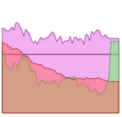
That brown-green line is wastewater data. For a long time it was slowly drifting down (yay!) but recently, it shot up steeply to a level up above the pretty-safe level. And then new data stopped coming in, so my dashboard graph kept showing the most-recent number, still up above the pretty-safe level.
San Francisco's wastewater data is pretty "noisy": big swings up and down. When that upward spike first appeared, I wasn't too worried. I'd seen spikes like that before; as more data came in, that seemingly-scary spike would probably turn out to be an outlier.
But then I realized I'd been looking at that probably-an-outlier number for over a week. That was unusual. So I investigated, and finally noticed on the documentation for the data my dashboard was fetching that the data hadn't updated since April 27. I was fetching my data on California's Open Data Portal that showed data from the California Water Board. Too bad that they'd stopped updating, but maybe not surprising since California had stopped its COVID emergency measures in early April.
I checked the California Department of Public Health's dashboard. It had recent data! It hadn't stopped updating on April 27!
With some poking around, I have a guess at what happened:
- Historically, California's big sewage treatment plants have sent health data to the California Department of Public Health
- Back in 2020, the state of California declared a health emergency
- When scientists figured out how to measure COVID-19 levels, the sewage treatment plants had to report their COVID-19 numbers to the California Water Board and the California Department of Public Health
- When California ended its health emergency, the sewage treatment plants kept sending measurements to the Department of Public Health, but stopped sending to the California Water Board
Anyhow, the nice California Department of Public Health people make their computed data available, so I suppose I'll switch my dashboard to use that:
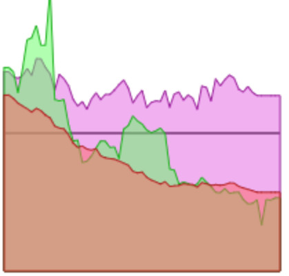
This chart looks similar-but-different. San Francisco has two sewage treatment plants. When I had the "raw" data, I could do fancy-pants calculations where I'd give one plant's measurement more "weight" if it had measured a bigger sample. Since I no longer have the "raw" data, I don't know the sample sizes anymore, so I just average together the two plants' measurements willy-nilly. It's fine.
Most importantly, this similar-but-different graph agrees with the old graph in that it suggests that the recent fall in reported new COVID cases was for real, not just false hope from reduced testing.
